
Here is my illustration of a zombie that is ment to represent me, i have used black marker to create this illustration. As you can see the only bit of colour i have used in this illustration is in the eyes and this is to help make the image pop up off the wall.

Here is the design of the zombie mushroom that i created to help add a symbol of a substance that the biker has taken and i thought making the mushroom into a zombie would help it blend into the overall image.

At this point one of the other members had started to create his zombie to represent him but he was using pastel to create his while i just used bold black marker.


In this section of the well we used mono print to put a ring on his knuckle, a design on his belt and patches on his jacket which all bikers have stitched onto their jackets. What I like about this prints is how they are so unnoticeable that when you notice them it gives you a hole new look on what the biker looks like and it adds more shape and texture to the bikers jacket.

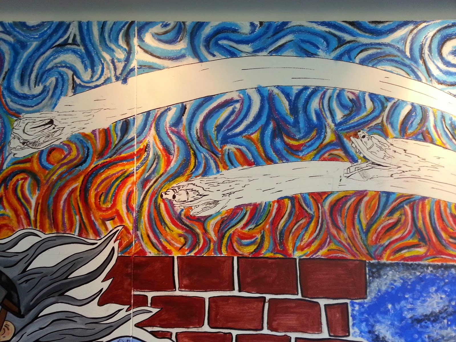
While me and another member of the group were working on the zombies the 3rd member of the group had started top create the ship that was firing cannon balls at the biker, this illustration was also created using pastels but the cannon balls were made from lino cut.

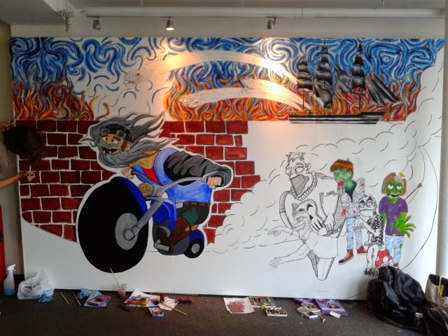
Here is a picture of the group working on the final piece and as you can see from the picture we have started to create the biker illustration and also the sky.

Here the 4th member of the group had his zombie created by also using pastel but out of all the zombies that were on the wall i think my favourite was his because how the hand looks like its coming out of the wall to grab you and how the bird is picking at its brain and the zombie doesnt seem fazed by it.

The 4th member of the group was in charge of createing the biker and to create this illustration he used acrylic paints. What i like about this illustration is how over exaggerated the biker is by how far he is leaning over the bike and how his face is crazy and that shows to me an element of substance that he has taken.

Here is the illustration the fat zombie that i designed for the wall and what i like about this is how it is the biggest zombie out of all 4 of them and this really adds to the image of him being fat and for this illustration i gave him green eyes almost to represent the green look of the dead zombies skin, i also think that how i used the line shading really adds a variety of techniques to the overall piece.

No comments:
Post a Comment